Theming
The UAC Launch Control terminal supports four visual profiles: Dark (default), Light, Terminal Green, and Custom. All themes are driven by CSS custom properties (HSL variables) with live preview — switch between them instantly and only commit on save.
Selecting a theme
Section titled “Selecting a theme”- Open Settings (
Ctrl+.) - Go to the General tab
- In the App Theme selector, pick your profile:
| Theme | Description |
|---|---|
| UAC PHOBOS | Default Phobos facility industrial. Neutral greys with UAC red accent. |
| MAYKR | A bright argent energy. Same structure, inverted for bright environments. |
| PLUTONIA TERMINAL | Green-phosphor matrix aesthetic. Early-90s UAC terminal feel. UAC red retained for warnings and destructive actions. |
| CUSTOM | User-defined palette via the Advanced tab editor. |
The interface updates immediately when you select a theme. Click > Apply < to save it permanently, or close without saving to revert to the previous theme.
Custom theme
Section titled “Custom theme”The Advanced tab now contains the Custom Theme Editor, only active when CUSTOM is selected in the General tab. Here you can paste HSL variable overrides for any of the theme’s CSS custom properties.
Format
Section titled “Format”Each line follows this pattern:
--variable-name: hue saturation lightness%;The values use the HSL color model:
- hue: 0–360 (colour wheel position, e.g.
0= red,120= green,240= blue) - saturation: 0–100% (intensity of the colour)
- lightness: 0–100% (brightness;
0%= black,100%= white)
All available variables
Section titled “All available variables”Background layers:
| Variable | Default (dark) | Purpose |
|---|---|---|
--bg-primary | 220 18% 5% | Main background |
--bg-secondary | 220 15% 9% | Card / section backgrounds |
--bg-tertiary | 220 12% 14% | Deeper nested surfaces |
--bg-card | 220 18% 8% | Game cards |
--bg-popover | 220 18% 9% | Dropdowns, popovers |
--bg-muted | 220 10% 18% | Muted/hover states |
--bg-sidebar | 220 18% 6% | Sidebar panel |
--bg-hover | 220 12% 16% | Hover state backgrounds |
Text layers:
| Variable | Default (dark) | Purpose |
|---|---|---|
--text-primary | 210 20% 92% | Headings, body text |
--text-secondary | 215 12% 70% | Secondary information |
--text-muted | 215 10% 75% | Subtle labels, hints |
--text-sidebar | 210 20% 92% | Sidebar text |
--text-card | 210 20% 92% | Card text |
--text-popover | 210 20% 92% | Popover text |
Accents:
| Variable | Default (dark) | Purpose |
|---|---|---|
--accent-highlight | 0 84% 60% | Primary accent (buttons, active tabs) |
--accent-destructive | 0 65% 45% | Destructive actions, errors |
--accent-ring | 0 84% 60% | Focus ring colour |
Borders:
| Variable | Default (dark) | Purpose |
|---|---|---|
--border | 220 12% 18% | Standard borders |
--border-input | 220 12% 16% | Input field borders |
--border-sidebar | 220 12% 14% | Sidebar separators |
Examples
Section titled “Examples”Cyperpunk Neon
Section titled “Cyperpunk Neon”
.custom {  --background: 265 50% 4%;  --foreground: 180 30% 95%;
  --card: 265 40% 7%;  --card-foreground: 180 30% 95%;
  --popover: 265 40% 6%;  --popover-foreground: 180 30% 95%;
  --primary: 320 100% 55%;  --primary-foreground: 0 0% 100%;
  --secondary: 265 40% 15%;  --secondary-foreground: 185 100% 70%;
  --muted: 265 30% 12%;  --muted-foreground: 265 20% 65%;
  --accent: 265 40% 16%;  --accent-foreground: 320 100% 65%;
  --destructive: 0 90% 60%;  --destructive-foreground: 0 0% 100%;
  --border: 265 40% 25%;  --input: 265 40% 20%;  --ring: 185 100% 50%;  --ring-color: hsl(var(--ring));
  --radius: 0;
  --bg-primary: 265 50% 4%;  --bg-secondary: 265 40% 8%;  --bg-tertiary: 265 35% 12%;  --bg-card: 265 40% 7%;  --bg-popover: 265 40% 6%;  --bg-muted: 265 30% 12%;  --bg-sidebar: 265 50% 3%;  --bg-hover: 265 40% 16%;
  --text-primary: 180 30% 95%;  --text-secondary: 265 30% 75%;  --text-muted: 265 20% 60%;  --text-sidebar: 180 30% 95%;  --text-card: 180 30% 95%;  --text-popover: 180 30% 95%;
  --accent-primary: 320 100% 55%;  --accent-secondary: 265 40% 15%;
  --accent-highlight: 320 100% 55%;  --accent-highlight-soft: 320 100% 55% / 0.15;  --accent-highlight-border: 320 100% 55% / 0.45;
  --accent-destructive: 0 90% 60%;
  --accent-ring: 185 100% 50%;
  --border-primary: 265 40% 25%;  --border-input: 265 40% 20%;  --border-sidebar: 265 40% 15%;}
PLASMA-CORE
Section titled “PLASMA-CORE”
.custom {  --bg-primary: 235 45% 4%;  --bg-secondary: 235 40% 7%;  --bg-tertiary: 235 35% 11%;  --bg-card: 235 40% 8%;  --bg-popover: 235 40% 7%;  --bg-muted: 235 25% 14%;  --bg-sidebar: 235 50% 3%;  --bg-hover: 235 25% 17%;
  --text-primary: 180 40% 95%;  --text-secondary: 190 30% 75%;  --text-muted: 190 15% 60%;
  --accent-highlight: 195 100% 55%;  --accent-highlight-soft: 195 100% 55% / 0.15;  --accent-highlight-border: 195 100% 55% / 0.4;
  --accent-destructive: 340 80% 55%;
  --border: 235 20% 22%;  --ring: 195 100% 55%;}
INDUSTRIAL RUST
Section titled “INDUSTRIAL RUST”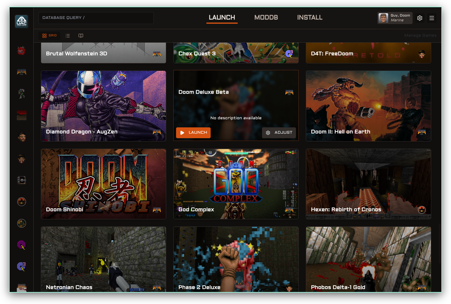
.custom {  --bg-primary: 25 10% 6%;  --bg-secondary: 25 10% 8%;  --bg-tertiary: 25 10% 12%;  --bg-card: 25 10% 9%;  --bg-popover: 25 10% 10%;  --bg-muted: 25 8% 15%;  --bg-sidebar: 25 12% 4%;  --bg-hover: 25 8% 18%;
  --text-primary: 35 20% 90%;  --text-secondary: 25 15% 70%;  --text-muted: 25 10% 55%;
  --accent-highlight: 20 85% 45%;  --accent-highlight-soft: 20 85% 45% / 0.15;  --accent-highlight-border: 20 85% 45% / 0.4;
  --accent-destructive: 0 75% 50%;
  --border: 25 10% 20%;  --ring: 20 85% 45%;}
UAC Sector 2
Section titled “UAC Sector 2”
.custom {  --bg-primary: 210 18% 7%;  --bg-secondary: 210 15% 10%;  --bg-tertiary: 210 12% 15%;  --bg-card: 210 15% 11%;  --bg-popover: 210 15% 10%;  --bg-muted: 210 10% 18%;  --bg-sidebar: 210 20% 5%;  --bg-hover: 210 12% 18%;
  --text-primary: 190 25% 92%;  --text-secondary: 190 15% 70%;  --text-muted: 190 10% 55%;
  --accent-highlight: 185 100% 45%;  --accent-highlight-soft: 185 100% 45% / 0.15;  --accent-highlight-border: 185 100% 45% / 0.4;
  --accent-destructive: 0 80% 55%;
  --border: 210 12% 20%;  --ring: 185 100% 50%;}
Sentinel Prime
Section titled “Sentinel Prime”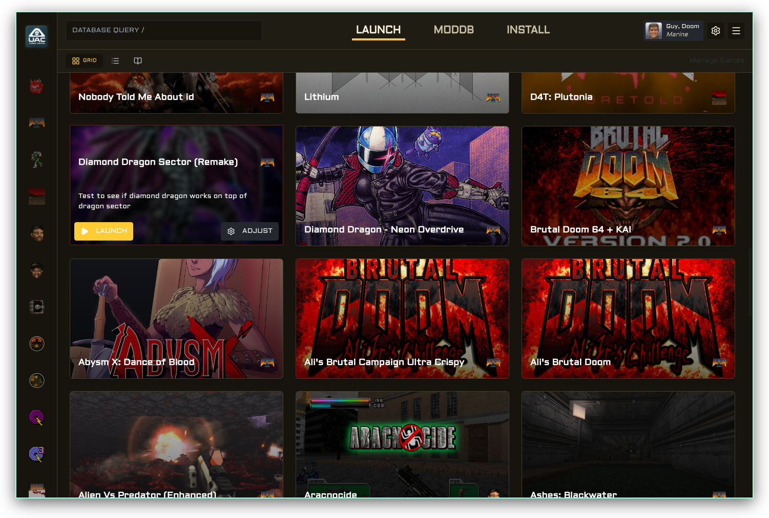
.custom {--bg-primary: 42 25% 7%;--bg-secondary: 42 20% 10%;--bg-tertiary: 42 15% 14%;
--text-primary: 45 60% 92%;--text-secondary: 42 25% 72%;
--accent-highlight: 45 100% 60%;--border: 42 20% 22%;}
BFG-9000
Section titled “BFG-9000”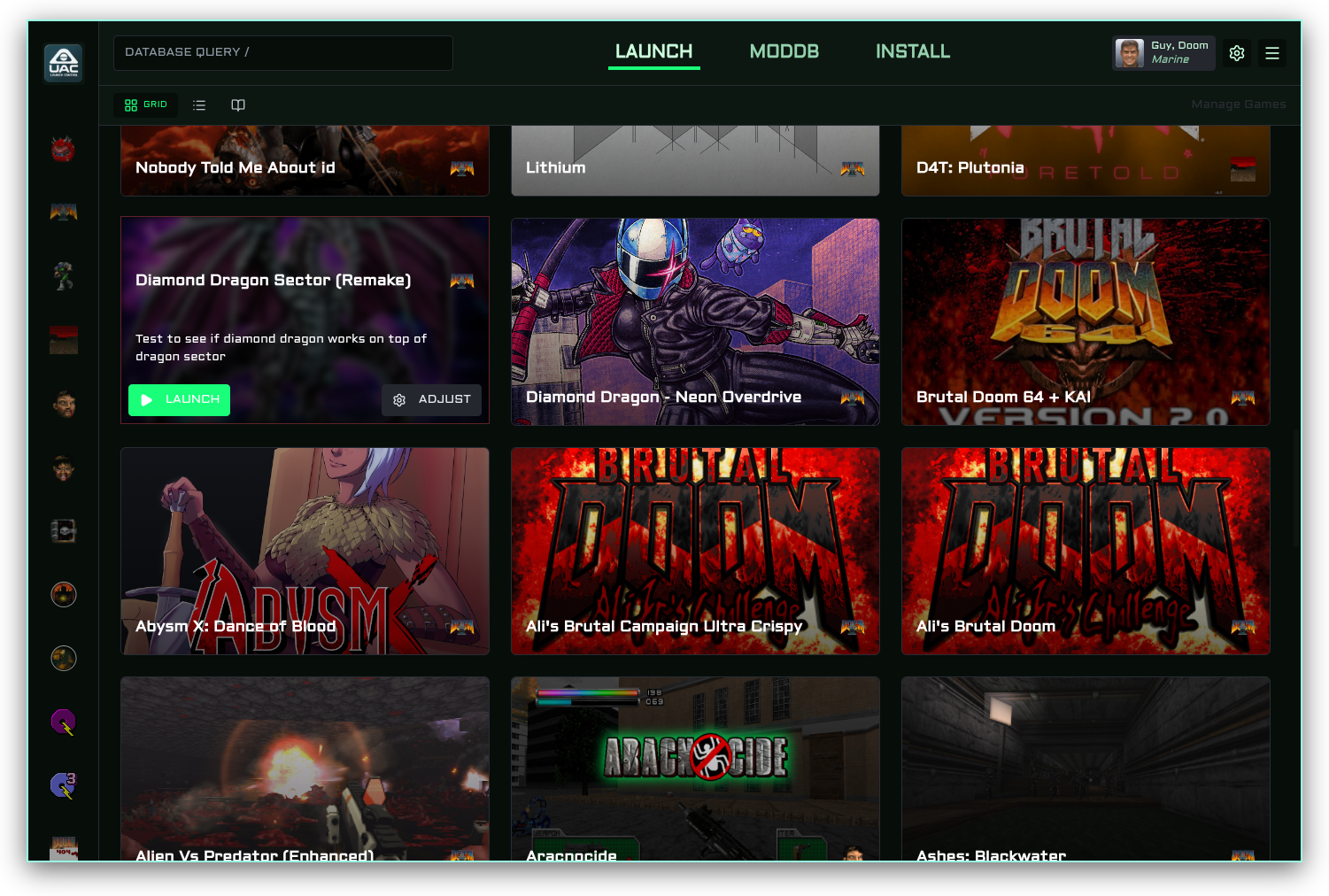
.custom {--bg-primary: 145 35% 4%;--bg-secondary: 145 30% 7%;--bg-tertiary: 145 20% 11%;
--text-primary: 140 100% 90%;--text-secondary: 145 40% 70%;
--accent-highlight: 145 100% 55%;--ring: 145 100% 55%;}
Flesh Pit
Section titled “Flesh Pit”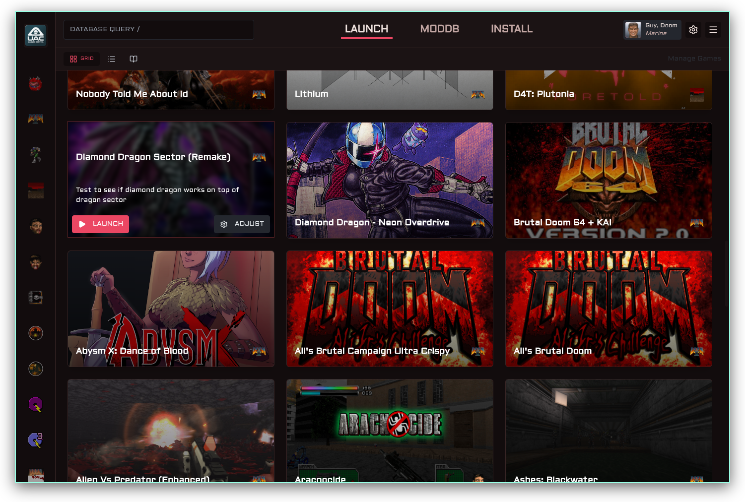
.custom {--bg-primary: 350 20% 6%;--bg-secondary: 355 18% 9%;--bg-tertiary: 0 15% 13%;
--text-primary: 15 35% 90%;--text-secondary: 5 20% 70%;
--accent-highlight: 350 80% 60%;--border: 0 20% 18%;}
Parchment
Section titled “Parchment”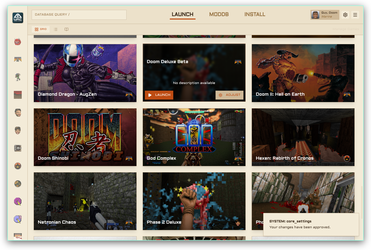
.custom {  --background: 42 52% 90%;  --foreground: 30 50% 13%;
  --card: 40 48% 86%;  --card-foreground: 30 50% 13%;
  --popover: 41 50% 88%;  --popover-foreground: 30 50% 13%;
  --primary: 20 82% 41%;  --primary-foreground: 42 52% 95%;
  --secondary: 38 42% 78%;  --secondary-foreground: 30 40% 22%;
  --muted: 39 38% 82%;  --muted-foreground: 34 30% 48%;
  --accent: 38 42% 78%;  --accent-foreground: 20 82% 41%;
  --destructive: 0 80% 35%;  --destructive-foreground: 42 52% 95%;
  --border: 36 30% 68%;  --input: 36 28% 72%;  --ring: 20 82% 41%;  --ring-color: hsl(var(--ring));
  --radius: 0;
  --bg-primary: 42 52% 90%;  --bg-secondary: 40 48% 86%;  --bg-tertiary: 38 42% 78%;  --bg-card: 40 48% 86%;  --bg-popover: 41 50% 88%;  --bg-muted: 39 38% 82%;  --bg-sidebar: 38 42% 74%;  --bg-hover: 36 36% 70%;
  --text-primary: 30 50% 13%;  --text-secondary: 34 40% 42%;  --text-muted: 34 25% 55%;  --text-sidebar: 30 50% 13%;  --text-card: 30 50% 13%;  --text-popover: 30 50% 13%;
  --accent-primary: 20 82% 41%;  --accent-secondary: 38 42% 78%;
  --accent-highlight: 20 82% 41%;  --accent-highlight-soft: 20 82% 41% / 0.12;  --accent-highlight-border: 20 82% 41% / 0.35;
  --accent-destructive: 0 80% 35%;
  --accent-ring: 20 82% 41%;
  --border-primary: 36 30% 68%;  --border-input: 36 28% 72%;  --border-sidebar: 36 28% 64%;}
VOID WALKER
Section titled “VOID WALKER”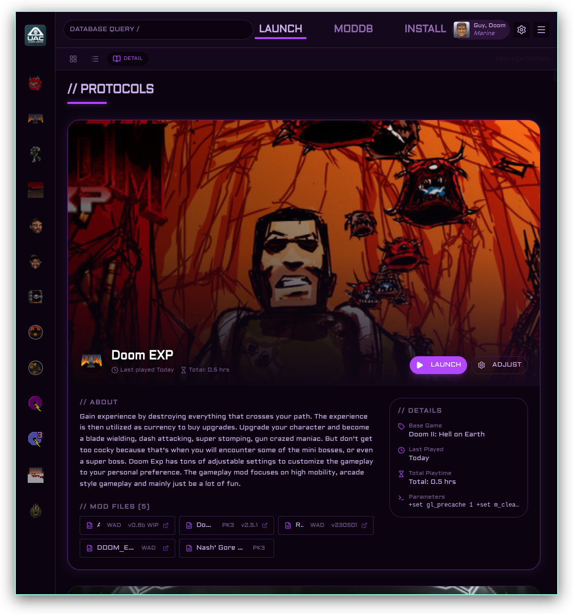
.custom {  --background: 275 60% 4%;  --foreground: 270 60% 81%;
  --card: 278 55% 7%;  --card-foreground: 270 60% 81%;
  --popover: 276 57% 6%;  --popover-foreground: 270 60% 81%;
  --primary: 275 100% 64%;  --primary-foreground: 0 0% 100%;
  --secondary: 280 48% 14%;  --secondary-foreground: 270 60% 81%;
  --muted: 278 42% 11%;  --muted-foreground: 275 28% 58%;
  --accent: 280 48% 15%;  --accent-foreground: 275 100% 64%;
  --destructive: 342 100% 59%;  --destructive-foreground: 0 0% 100%;
  --border: 278 45% 20%;  --input: 278 44% 17%;  --ring: 275 100% 64%;  --ring-color: hsl(var(--ring));
  --radius: 25px;
  --bg-primary: 275 60% 4%;  --bg-secondary: 278 55% 7%;  --bg-tertiary: 280 48% 10%;  --bg-card: 278 55% 7%;  --bg-popover: 276 57% 6%;  --bg-muted: 278 42% 11%;  --bg-sidebar: 275 62% 3%;  --bg-hover: 280 48% 15%;
  --text-primary: 270 60% 81%;  --text-secondary: 275 35% 56%;  --text-muted: 275 22% 45%;  --text-sidebar: 270 60% 81%;  --text-card: 270 60% 81%;  --text-popover: 270 60% 81%;
  --accent-primary: 275 100% 64%;  --accent-secondary: 280 48% 14%;
  --accent-highlight: 275 100% 64%;  --accent-highlight-soft: 275 100% 64% / 0.15;  --accent-highlight-border: 275 100% 64% / 0.45;
  --accent-destructive: 342 100% 59%;
  --accent-ring: 275 100% 64%;
  --border-primary: 278 45% 20%;  --border-input: 278 44% 17%;  --border-sidebar: 278 42% 14%;}